This is the final post in a series on digital marketing terminology. Our goal as an agency is to speak authoritatively and execute effectively. We desire to guide our clients to success through the world of digital marketing while not losing them in a cloud of jargon. To that end we are sharing a series of blogs to help familiarize business leaders of every stripe with the terminology they may encounter when engaging in marketing activities.
By now we’ve defined key terms as they relate to Sales & Marketing, Search Engine Optimization, Website Development & Hosting, and Digital Advertising. Here we wrap our series addressing terms encountered in the creative world of Graphic Design, Photography & Video.
“Photoshop our product into this picture.”
“You can edit that out later, can’t you?”
“Make it pop!”
“I don’t have any specific ideas, I trust you!”
“Just give me something to react to.”
Every creative who ever was, or at least in the last few decades, has heard some of these familiar refrains. They have a client with an image in their mind and they’re trying to produce something to match the vision buried deep within their client’s cerebral recesses.
While it may seem to be the case, creative artists in the world of graphic design, photography and video are not miracle workers, much less mind readers. There are, in fact, limitations (although growing slimmer by the day with the advent of AI) to the things they can do with a camera and computer. The process of closing the gap between client and creative might start with ensuring both parties are speaking the same language.
For the non-creative, while it may seem inconceivable, you might run the risk of sounding silly when you ask the seemingly impossible of a designer, photographer, or video editor. The following are common terms used in the creative side of marketing on a daily basis. It’s not an exhaustive list but enough to help you communicate with the marketing creatives in your life.
HELPFUL HINT: Looking for a specific term? Use the find functionality on your browser – Cmd+F (Mac) or Ctrl+F (PC) – to quickly find the word or phrase you are looking for. We opted for contextual rather than alphabetical organization when sharing this information.
The extra stokes and flourishes at the end of letters. Oft used serif fonts include Times New Roman and Georgia.
Fonts without added strokes at the ends are called san serif fonts. Well-known san serif fonts include Arial and Helvetica.

Script fonts are designed to resemble handwriting, whether cursive, calligraphy or something less formal.
Slab serif fonts feature blocks and square edges at the ends of letters.

Measures the space between individual letters.
Measures the space between a group of letters.
Pronounced “ledding,” leading is the space between lines of a text.

This is placeholder text used by designers to indicate that text not yet provided will fill a designated space. Lorem ipsum has an interesting history if you’re into that sort of thing.
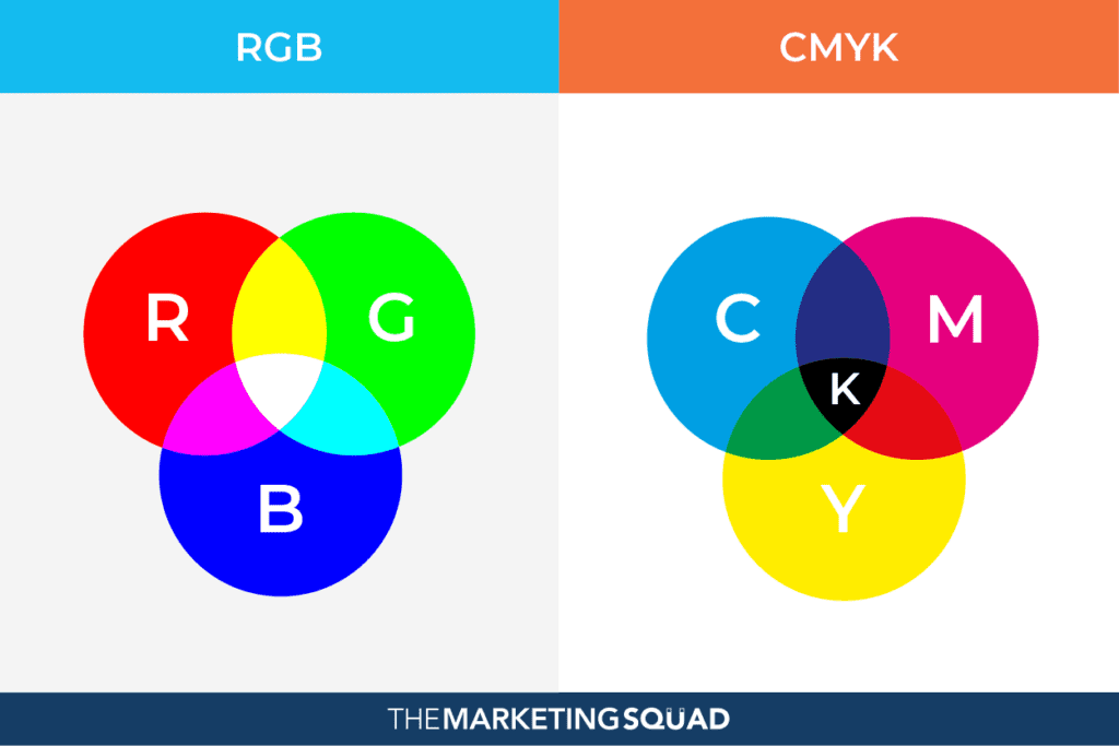
RGB color is a model in which Red, Green, and Blue light is added together to produce the desired color. When all three colors are at 100% (or 255 on most design programs) white is produced. RGB tends to be used for on-screen purposes.
The four-color process used in color printing. This abbreviation stands for Cyan, Magenta, Yellow and Key, which refers to black. When all four colares are at 100% black is produced. CMYK is used for any design intended for printing.
A six-digit code that represents a specific color used in website code and graphic design software.
The Pantone Matching System (PMS) is a standardized numerical classification of precise color identification for color printing. Brands will utilize Pantone colors in their printing to ensure an exact match is made consistently.

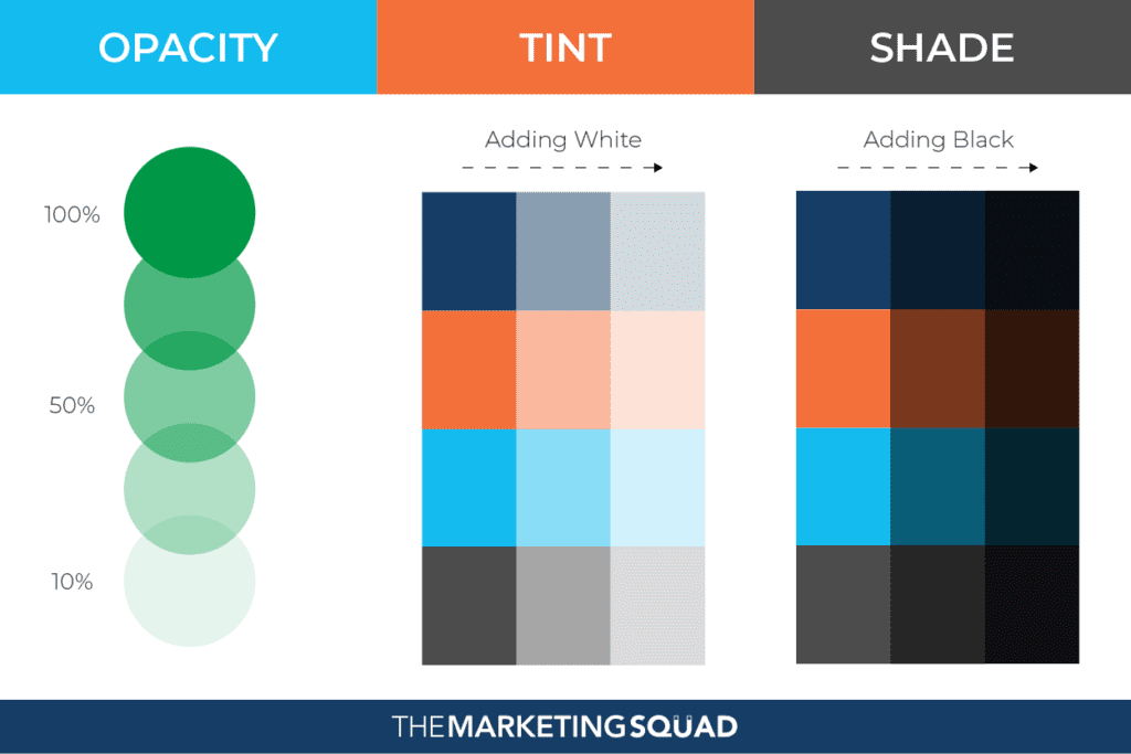
The measure of an element’s transparency. The higher the opacity, the less you can see what lies behind it. The less opacity, the more transparent the element is.
By adding white to a color, you change that color’s tint and add variety to your design.
By adding black to a color, you change its shade and make it darker.
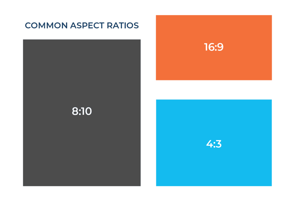
The proportional relationship between the width and height of a rectangle. Often defined via a mathematical ratio such as 4:3 or 16:9.
Technique used to create visual interest in photography and design. The image is evenly divided into a 3 x 3 grid and the focal point of the image is placed at the intersection of the lines.

Also known as negative space, this is the space between graphic elements, images, copy, and anything else on the page intentionally left blank to draw attention to key components of the design.

Measures the quality of a raster image. Higher resolution images have sharper images with cleaner lines. Lower resolution images can become pixelated and fuzzy.

The smallest basic component of an image. Each pixel is an individual color. The more pixels an image has, the higher the resolution and overall quality of the image.
A simple sketch or skeleton of a layout produced to show the essential elements and their hierarchy on a page before time and energy is spent designing a detailed version. A wireframe may include some headlines and top-level text, but rarely do wireframes include body copy, photographs or even color.

The portion of an image or design that extends beyond the finished edge of a printed document. Enough bleed should be included on digital files to ensure that the printed document has color and imagery all the way to the edge.
Raster images are made up of a collection of tiny, uniformly sized pixels, which are arranged in a two-dimensional grid made up of columns and rows. When a raster image is scaled up the image becomes blurry or pixelated. Examples of raster files are JPEG, TIFF, and PNG.
Vector graphics are created using a sequence of commands or mathematical statements that place lines and shapes in a two-dimensional or three-dimensional space. A vector image can be scaled up infinitely without becoming blurry. Examples of vector files are AI and EPS.
Adobe Illustrator. Layered vector file format.
Photoshop Document. Layered raster file format.
InDesign Document. Layered file used primarily for print layouts.
Joint Photographic Experts Group. Photo file format used for lossless image compressing allowing for easier sharing.
Graphic Interchange Format. Photo file format for animated or static images.
Portable Network Graphics. Another lossless image compressing format but one that allows for a transparent background.
Encapsulated Postscript. A non-proprietary vector file format.
Portable Document Format. Created by Adobe, this versatile file format “gives people an easy, reliable way to present and exchange documents - regardless of the software, hardware, or operating systems being used by anyone who views the document.”
A RAW file is the uncompressed and unprocessed image data captured by a digital camera or scanner’s sensors. Shooting in RAW captures a high level of image detail, with large file sizes and lossless quality.
Tag Image File Format. A raster image file format utilized for high-quality images when detail and color accuracy are a concern.
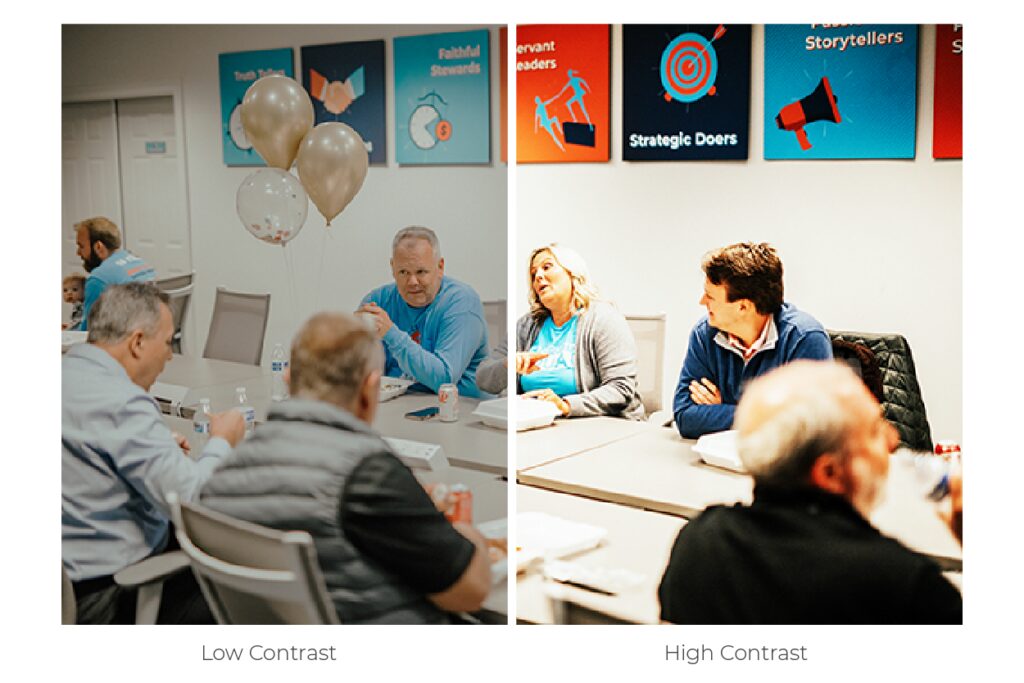
The effect of two opposing colors are used in design or photography to create separation between elements or simply add interest to the image.
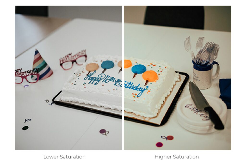
The vividness or brightness of an image. An image with higher saturation will have brighter colors while a lower saturation image will appear duller and more flat.
Determines a camera’s sensitivity to light. The higher the ISO, generally the brighter the image will be.
A noisy image may also be referred to as grainy. Noise in an image is created when the camera’s ISO setting is too high.
In order for images to appear more natural a photographer will adjust the white balance to avoid producing images that are unnaturally yellow or blue.
The distance from the lens to the image focus point inside the camera. This is usually measured in millimeters. A high focal length makes distant objects appear magnified while a low focal length gives a wide view of the scenery facing the lens.
Refers to the amount of time light is allowed to hit a sensor of film. Overexposed images will appear whiter and washed out. Underexposed images will be dark.
Refers to the part of an image that remains in focus. Often portrait photography and cinematic film will use a narrow depth of field meaning the subject of the image is in focus while objects in the foreground or background are out of focus. This draws dramatic attention to the subject of the image.
Refers to the size of the opening in a lens controlling how much light is allowed to enter the camera. Aperture is measured by the f-stop. A small f-stop like f/1.8 is a wide opening, a large f-stop like f/22 is a very narrow one
Measures how long a shutter is open allowing light to pass through to the sensor or lens. Faster shutter speeds are used for quickly moving objects while slower shutter speeds can be used for things like landscapes or portraits.
The arrangement of different elements within a photographic frame. A desirable composition is achieved by repositioning the camera, zooming in and out, or by cropping an image after a photo has been captured.
Secondary footage that is captured to support the main action or message of a video. B-roll is used to provide context, visual interest, and variety to a video.
Adobe’s digital visual effects, motion graphics, and compositing application. After Effects is utilized to enhance a video by adding graphics to footage a photographer has captured or by creating the entire visual of a video using motion graphics.
Any graphic with movement. Motion graphics can come in many styles, but it usually refers to the combination of text and design elements set to motion. Motion graphics should not be thought of as animation with characters and voice overs. More so, motion graphics are leveraged to impart information or add visual flourishes to videos. Motion graphics can be used to animate a logo, add a name key to the lower third, or illustrate key points of a message.
The bottom portion of a video is often used to insert a subject name and title, place closed captions, or add other helpful information.
The opening or closing graphic of a video that helps to add context or a call-to-action supporting the main message of a video.
ADDITIONAL RESOURCES
52 Design Terms and Tips to Level-Up – Buffer
100 Graphic Design Terms You Should Know – Rasmussen University
50 design terms explained simply for non-designers – Canva
25 Common Photography Terms All Beginners Need to Know – Creative Live
A guide to basic photography terms – Adobe
Your A-Z glossary of video terminology you should know – Vimeo
Subscribe to our newsletter to follow this series and learn other valuable marketing tips and insights.


Copyright 2026 The Marketing Squad | Privacy Policy | Disclaimer | Terms of Service