This summer I had the grand privilege of driving a friend’s Toyota Hybrid across The Great Land of the Free: from The City of Angels to my home here in the Lou. It was a pleasant and rejuvenating experience, and I’m stealing the opportunity to spill just a few small anecdotes about my time by cross-comparing a few random benchmarks to your sucky website.
 Growing along Route 66, the famous Cadillac Ranch of Bruce Springsteen’s 1980 album The River.
A question I got repeatedly during and after the trip was whether I drove the ol’ Route 66. Our Mother Road, the Main Street of America, one of the original highways within the U.S. Highway System— it’s a beautiful piece of history. Did I drive it? A little. But not because I wanted to necessarily.
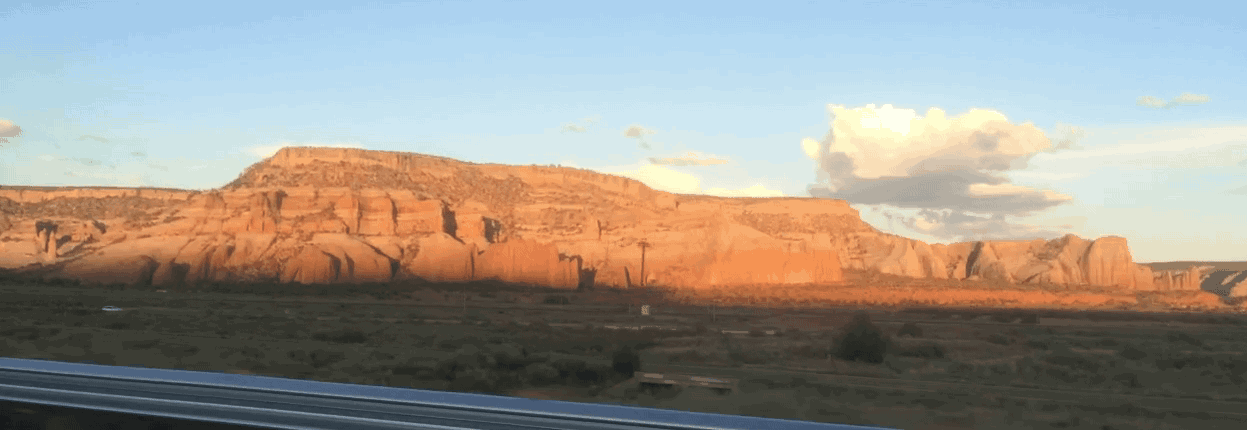
Interstate 44, the road that notoriously stole traffic from Route 66, has been the saving grace of travelers since it was developed back in the ‘50s. The speed limit is mostly 80mph instead of 55 (or sometimes 35), and there aren’t stop-lights, oncoming traffic, tractors, and pot-holes.
Sure 66 is retro and historic, but (and don’t kill me for saying this) after hundreds and hundreds of miles, it’s also just old and dated. When I tell you that your website reminds me of our Mother Road, that’s what I mean. Websites need to DRIVE TRAFFIC. That’s their job. I only ever saw a car on 66 rarely. I made traveling-besties on I44. It’s time to upgrade to an I44.
TL;DR: while your website may be sentimental and the eye-candy of it’s day-- all it is now is slow, dated, ugly, and for that, not driving traffic.
In preparation for this trip, I was reminded by just about everyone I mentioned it to, to lay-out my fuel stops. “Running out of gas = not good.” Cool. I took their advice. Mistakenly, though, as fate would have it, I missed a stop at one point and we drove 20 minutes on E in the middle of the desert. It wasn’t worth it. Thankfully, we just barely made it to the petrol, using the Hybrid’s battery.
Our goal when creating websites for our clients, besides making them beautiful, informative, and searchable, is to make them useful not only to the target audience but to the business. Internal pages should have CTAs (Calls To Action) and copy should contain backlinks. Forms should be installed for retrieving emails, and Landing Pages should provide helpful information for users, in trade of useful information about the user that can be used by our client.
TL;DR: If your internal web-pages aren’t build to not only generate traffic, but sustain and garner leads from that traffic, people will “run out of fuel” / lose momentum, and you will in turn, lose prospects.

We actually hadn’t planned to go to the Canyons, as we were stretched on time as it was for our first stop. Remorse however, sunk-in about an hour past the park and we ended up backtracking. We drove 17hrs that day but it was totally worth it. Being surrounded by such majesty as the Canyons is existential and intimidating in beautiful coalition.
Your website on the other-hand is intimidating in a not-so-good kind of way. It isn’t giving anyone a reality-check either. Unlike the the GC, websites shouldn’t be all above-the-fold and in your face. Their job is to guide people down a path that ultimately lands them at a destination. The layout of the Home Page, how the site scrolls and reads, the navigation, and the CTAs should be given thought and strategy.
TL;DR: Above the fold is a ‘90s game that many people still play.
Before our trip, we were given 15 paper maps from AAA covering each of the states that we would be even in remote proximity of. We also had iPhones, 3G, and car chargers. The maps have small font, and take up space and time trying to understand and locate things on. The GPS on the phone thought for us. It gave us exactly the information we needed when we needed it, and nothing more. Needless to say, the maps ended up in the box.
If your website doesn’t fit exactly the information a viewer needs in a readable format that fits on a mobile device, you are missing out on possibly 85%* of your possible traffic. Just sayin’.
*Actually it could be more or less depending on your target audience. We would be happy to help you out with understanding yours!
TL;DR If your website isn't optimized for mobile devices, you may as well throw it in a glove-box. You’re out of date.
All-in-all I had a great trip and for the most part, I was able to not think about web-design the entire time. Hopefully, after reading this though, you’ll reach out to us about fixing your sucky website and get you off Route 66 and back on Interstate 44.
Copyright 2026 The Marketing Squad | Privacy Policy | Disclaimer | Terms of Service